UC Press Book Cover Design Beyond the Digital Space
The work of a book designer in the contemporary publishing landscape is often restricted to the digital space. All books are on a timeline and at the end of the day, computers are just faster at most of the things book designers are asked to do. When given the opportunity, however, designers love to get physical with their bookmaking practice. In this post, we speak to three UC Press designers about times when their process got “down and dirty” with materials, method, and craft.
As art director of University of California Press, Lia Tjandra gets to mash words, images, and colors together to form books, and direct an amazing team of designers to do the same. Outside of work, you can find her in very messy situations with her children and pets.
Kevin Barrett Kane is a book designer, typographer, and educator. With fellow book designer Emma Christine Hall, he founded Benson & Benson and the Contemporary Book Design education platform.
Michelle Black is a multidisciplinary artist and designer who came to book design by way of printmaking (screen printing, letterpress, papermaking), sculpture (metal and wood), and a persistent childhood obsession with magazine layouts.
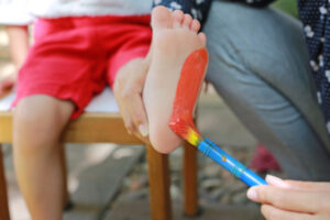
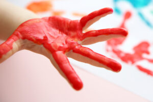
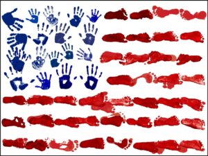
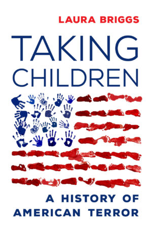
Laura Briggs, Taking Children – designed by Lia Tjandra
I make art with my kids all the time, and enlisted their help to create the cover image for Taking Children. They were seven and five at the time we took their foot and handprints to create the cover artwork. We got paint all over the backyard and had a fun time, which contrasted quite a bit from the heavy topic of the book. I hugged them tighter that day and in deep gratitude of my good fortune.
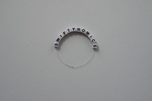
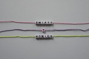
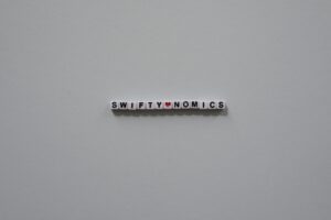
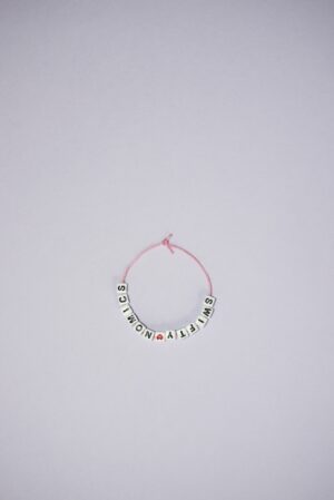
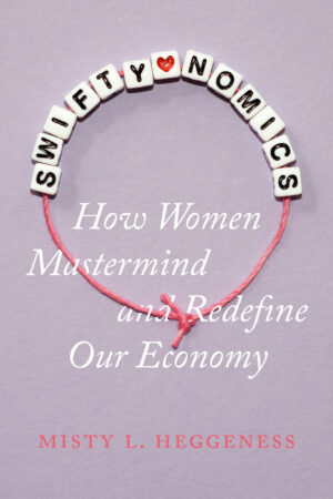
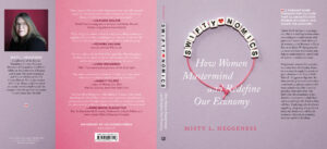
Misty L. Heggeness, Swiftynomics – designed by Michelle Black
There were a couple of very strong visual concepts to play with for this cover. We discussed glitter and fringe as possible ways to evoke the image of Taylor Swift without using her photograph. Ultimately, the image of the friendship bracelet was chosen because this book is not about Taylor; it’s about her fans and how they choose to spend their money. The bracelets are often made at her concerts and traded between fans—an alternative economic exchange. The design also references beads as historical currency.
I beaded a friendship bracelet and photographed it, also making an inline version for the spine. I tried many different layouts, string colors, versions with and without the heart bead, and background colors, before getting all the small details right for the final shot (if you’re not spending half a day ironing thread are you even working?)
Fully embracing the beading technique in digital form, I interlaced the subtitle onto the bracelet. The beads are spot glossed to add sheen and dimensionality as a finishing touch on the jacket.
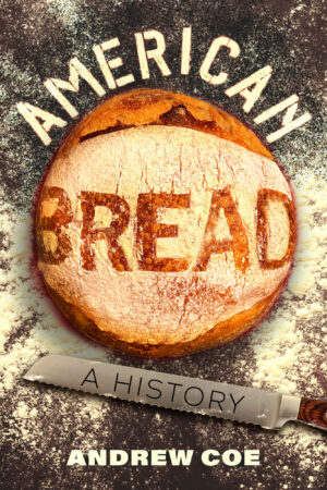
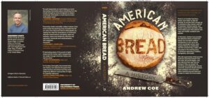
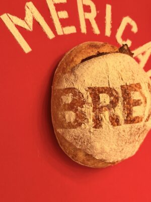
Andrew Coe, American Bread – designed by Kevin Barrett Kane
We knew we had something special with Andrew Coe’s history of American Breadmaking and culture when it was first signed. Thus came the inevitable roundtable discussion(s) about what the book should look like. Being a definitive “history” there was some inclination at first to feature some kind of archival photograph on the cover, or perhaps the dreaded collage approach. Through our conversations with marketing and editorial teams, the driving question ultimately became: “What does a tasty cover look like?” Though initially beset by this question, I soon remembered that a dear friend of mine owns a sourdough bakery here in town. Though the sourdough leavening process can be traced back to the middle ages, it has long been known as an American (specifically San Franciscan) tradition.
I approached my friend and asked how we might be able to turn one of her loaves of bread literally “into the cover.” We spent a cold winter’s day inside the stifling hot bakery churning out samples before we found a reliable way to trace and bake letterforms using bread. There were many failed attempts. Ultimately, we chose to back out the letters using stencils and to form the word “American” in flour above the loaf.
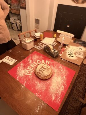
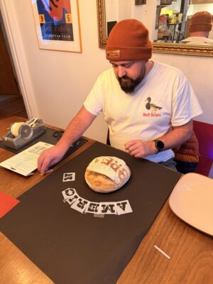
After even more trial and error, I was able to shoot a clean run of cover art possibilities on a red cardstock background. Once I got this into my computer, it took only a little more manipulation to get things to gel.
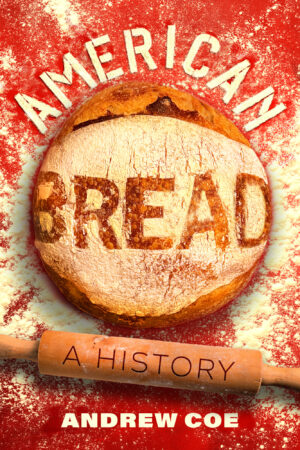
Ultimately it was decided that red was not the ideal color for this cover, and a rolling pin was not a tool used very often by breadmakers, so we opted for a breadknife instead.