"Sappho" Through the Decades — with a Behind-the-Scenes Look at the New Collector’s Edition
By Jyoti Arvey, Editorial Assistant at University of California Press
As one of our bestselling literary translations, Mary Barnard’s Sappho has undergone many re-releases since it was first published by the University of California Press in 1958. Long praised as an unparalleled translation of Sappho, lyrical and moving, Barnard’s Sappho has an intimacy and playfulness that allow the poet’s voice to reverberate into the present.
As classicist Melissa Mueller writes in her Introduction to our new Collector’s Edition, “Barnard’s translations have introduced generations of Anglophone readers to Sappho’s poems in language notable for its simplicity and accessibility. Barnard’s Sappho is even today a poet who gives voice to marginalized, seemingly forbidden feelings. She speaks to us directly, with a poetic craft and musical sensibility that are simply unrivaled.”
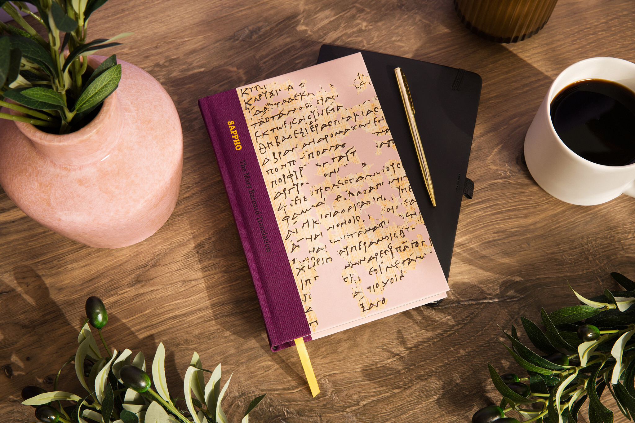
When I became the editor of this new edition, I didn't realize quite how much this project would teach me about bookmaking. From discussing Mary Barnard's unique ordering of the poems with Melissa Mueller, to reviewing the tiniest of details, such as font size, with our production team, I learned about how the legacy of a particular work of literature is passed down — both in the actual words on the page and in the format and design of the book itself.
This was most evident in the wide-ranging cover designs of the book through the years. In the 68 years that this classic translation has been in print, the book has had five unique covers that each reveal facets of the poet herself, as well as her place in our culture today.
The original cover, designed by Adrian Wilson, features a bright orange background with a line illustration depicting two women together with their harps. The scene alludes to the common theme in Sappho’s poetry of women gathering, playing music, and telling stories. The stylized design element at the bottom of the page also references the ancient Greek past, highlighting the historical context of the poetry and the world that Sappho was writing about. An illustrated frontispiece has remained from that first publication, and will be included again in the Collector’s Edition—a thread that weaves these editions together.

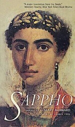
A new paperback edition was released in 2000, with a cover focused on the poet herself. Since there are no surviving depictions of Sappho, designer Nola Burger used a stand-in with a woman referred to as Eirene. The painting was originally created as a Mummy Portrait in about 40-50 CE in Egypt, and is currently held in the Landesmuseum Württemberg in Germany. The leafy headpiece acts as a visual reference to the ancient past, but we’ve zoomed in closer to the scene. The woman stares the reader straight in the eye. There is an intimacy in this representation of Sappho, a directness that echoes her unique style. In her poetry, she speaks to and about her friends and confidantes. This cover makes the reader her addressee as well, pulling them into Sappho’s circle.
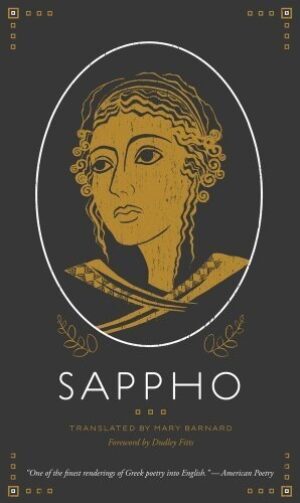
For the 2012 edition, designer Madeleine Ward created an original illustration with a more minimalistic and contemporary portrayal of Sappho, where her gaze drifts up and away from the reader. With its elegant framing and more abstract style, this depiction of Sappho embraces her status as an icon. As Mueller discusses in her introduction, there is no doubt that Sappho has become a queer and lesbian icon to generations of people, in addition to being a symbol for women poets in general.
In recent years, the covers have moved to highlight the textual nature of our connection to Sappho. In 2019, UC Press Art Director Lia Tjandra redesigned the cover for our World Literature in Translation series. The series began featuring UC Press backlist classics, repackaged as modern and elegant paperbacks, with the first few titles featuring one-name ancient authors. Lia thought, “Here’s my chance to finally design a series with large initial letters as the main design element!” Sappho thus was embodied by a gorgeously rendered “S” that swept in loops and turns across the new cover.

Yet there was still an opportunity here to create an elegant, clothbound collector’s edition of Sappho — one that any poet or literature lover would want to showcase prominently on their bookshelf. Lia pulled out all the bells and whistles for this “designer’s dream project.” With its beautifully colored and textured binding and ribbon bookmark, this edition echoes the recent collector’s edition of Basho. The cover image depicts the papyrus fragment of Sappho’s Poem 44, one of the longest of the surviving fragments, and uses blind spot gloss letters to fill in the fragmented text. “This proved quite a challenge, and ended up taking a while to complete. It was only possible with the help of editor Melissa Mueller,” Lia told me. “Versa Press was able to apply the spot gloss to perfection.”
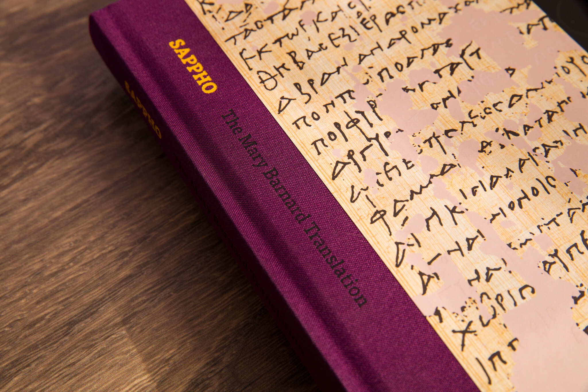
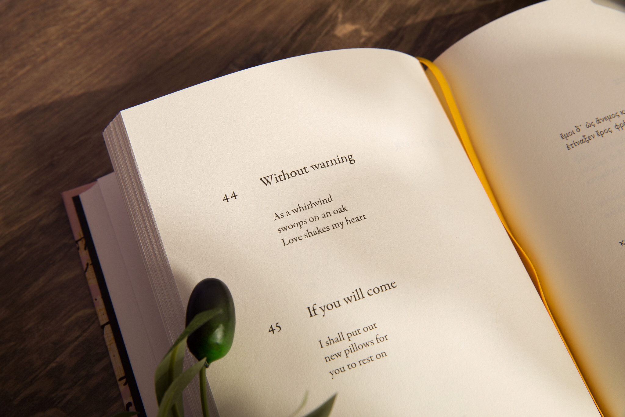
This clever design shows both what we have lost of Sappho’s text—we have, at most, a tenth of the entirety of her work—while highlighting what has survived or been restored. When we engage with Sappho today, it is impossible not to consider these elements of her work and legacy. As Mueller says, “I feel like the focus on survival has taken on new urgency. While the papyrus used to be more of a scholarly image, it can be read now as a sign of the precariousness of life (and afterlives) on earth, both artifacts from the past and the present. If not for these tattered scraps, there would be no Sappho to translate, read, or collage.”
With this new edition, which includes the Greek text alongside Barnard’s translation for the first time, we hope to continue the legacy made possible by the survival of these precious fragments.
About the Author

has been an Editorial Assistant at UC Press since 2023. Previously, they worked as a bookseller at the queer community bookstore, Fabulosa Books (formerly Dog Eared Books Castro), in San Francisco.