A Deep Dive into Cover Design with UC Press Designers

Every book cover is a sartorial representation of what lies within: the author’s years of thought, study, and writing; the publisher’s hopes and strategy; the reader’s curiosity and engagement. No wonder, then, that book covers vary so widely in color, type, imagery, and form. What role can authors play in the designer’s work to harness these aesthetic characteristics and craft a successful design for their cover? UC Press book designers Kevin Barrett Kane and Michelle Black offer their knowledge, advice, and insights on what makes a good cover and how to effectively collaborate with the creative artists who fashion the look of your book.

Kevin Barrett Kane is a book designer, typographer, and educator. With fellow book designer Emma Christine Hall, he cofounded the Contemporary Book Design Workshop.
Michelle Black is a multidisciplinary artist and designer who came to book design by way of printmaking (screen printing, letterpress, papermaking), sculpture (metal and wood), and a persistent childhood obsession with magazine layouts.
What is a type cover versus an image cover? Are there covers that do both?
KBK: With very few exceptions, book covers include some kind of text, usually the title, subtitle, and author byline, and sometimes other marketing copy. Many covers combine this necessary informational text with art, often a photograph, illustration, or painting. Image-based covers like these lean on contextual clues within the artwork to add meaning. This is what we call “text and image.” Alternatively, a true type-only cover relies only on typography to capture the essence of the design. This tends to be a more rigorous task for the designer, who needs to choose (and perhaps alter) typography in such a way that represents the text.
Here are a few examples:
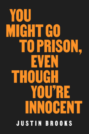
For Justin Brooks’s You Might Go To Prison, Even Though You’re Innocent, the title alone contains the implicit threat of the book’s main argument, so a type-only treatment for this cover was appropriate, and the colors, typography, and layout of that type were duly considered. I chose VTC Martin, a typeface named after Martin Luther King Jr. and based on the Civil Rights protest posters “I Am A Man.” The result is a deceptively simple cover that nonetheless has an impact.
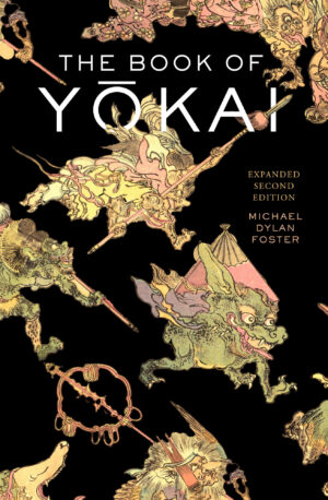
Michael Dylan Foster’s The Book of Yōkai is a different kind of cover, featuring nineteenth-century Japanese painter and caricaturist Kawanabe Kyōsai’s masterful illustrations of the supernatural monsters that inhabit Japanese folklore. They add to the play and dynamism of the design, bringing chaos where there should be chaos. The typography here is restrained and merely informational. To do more with it would have been to place it in competition with the art. For this book of monsters, it was a bit of a no-brainer that monsters should feature heavily on the cover. This is not always true, of course.

For the cover of Kevin Lewis O’Neill’s Unforgivable, chronicling the systemic covering up of sexual abuse by the Roman Catholic Church, I thought a lot about monsters of a different kind. But never once did I consider putting an image of one of these abusive priests on the cover of the book. To do so would have been inappropriate and potentially triggering for victims and readers alike. I was tempted to approach the design from a type-only perspective until the author provided the photo of an unidentified young boy, walking in front of a marbled facade with threatening skies. To drive the threat home, I digitally ripped the image into the shape of a cross and placed it in the center of the composition over a red background. I then paired this imagery with an upright Didone typeface that is just dripping with serifs. This is type and image working together in harmony to convey the sinister nature of the book.
How does an author know whether a type cover or an image cover is best for their book?
MB: Either can work for many books. Designers are not only considering aesthetics; a successful design will conceptually connect to the content of the book. This can be as broad as a meaningful color or as specific as a piece of artwork created by someone interviewed in the text. Then there's knowing when to lean into the conventions of your genre and audience versus when to push boundaries (designers love to push boundaries!). And last but not least: legibility! As much as we like to play with type, for instance, it does have to perform its essential function, which is to identify the book.
So although envisioning an image may be the first step in thinking about what kind of cover you want for your book, I think the question is really, Will an image be appropriate for my book?
A good visual pun, when done well, can be arresting. And images are just generally nice, whether prominent and singular (also known as a “hero image”) or a little more subdued, serving as an accent to the cover copy. But consider whether an image might do more harm than good, especially in the case of sensitive, traumatic, or otherwise difficult subjects. An example of this is Blacksound, which traces the history of pop music in the United States and often grapples with the image of the Black minstrel. The author specifically requested a type-only cover to avoid further perpetuating the harm of that imagery.

Other times there just aren’t great images to work with. Perhaps what’s available is too expensive, or maybe the image is low-quality and won’t reproduce or print well. Type-only to the rescue!
In some cases, type-only is the most appropriate or the only viable option. But type-only is a great option in its own right! Type-only covers often give the designer more room to choose fonts and play with the configuration of the type (also known as a “lockup”).
What are some typography basics authors should know?
KBK: Start with the difference between the terms font, typeface, and typography.
- Typography is the art and study of designing, arranging, and composing type.
- A font is a digital or analog collection of characters, combining not just the 26 uppercase and lowercase letters of the roman alphabet but also arabic numerals of several cases, punctuation, diacritics, and thousands of other characters (called “glyphs”) necessary for meaning-making in today’s age. (Does this get infinitely more complicated with other scripts/languages? YES.)
- A typeface is a collection of fonts that all relate to one another stylistically. The typeface named Helvetica includes a handful of different fonts: Helvetica Italic, Helvetica Bold, Helvetica Bold Italic, and so on.
For a bonus, know the stylistic differences between the two major typographic categories: serif and sans serif. And if you’re really feeling ambitious, choose some typefaces you love and research more about them: who made them, what their influences were, and what their work, in turn, influenced. A great place to do this kind of research is at Fonts in Use.
For a type cover, how do designers choose and work with the typeface?
KBK: This is possibly the hardest decision any designer has to make. There are five parameters I consider when choosing type for a cover:
- Is the type culturally and/or historically responsive to the text? A history about seventeenth-century France begs to be adorned with Garalde type (so named for their stylistic connections to French punchcutter Claude Garamond and Italian Printer Aldus Manutius).
- Is the type aesthetically pleasing? Though we all aspire to embody Peter Mendelsund’s mandate, “I prefer an ugly cover to a cliché one,” our covers are judged first and foremost for their beauty. Choice in typography does a lot of this work.
- Does the copy fit with the chosen type? This is a technical requirement that relates to the concept of “lockup,” which Michelle mentioned before. Simply put: Does everything fit, and is it still legible at the size you have to make it? A wide, bold typeface might be impactful for a word like “Cult,” but a longer word like “Constitution” requires more delicate sizing. (Luckily, for one particular title with both those words in it, “cult” was more important, anyway.)
- Is the chosen type legible, even at thumbnail size? Contemporary book designers are totally beholden to the Amazon thumbnail. These days, it seems titles must be readable from one hundred yards away. There are glorious exceptions to this, as with any “rules” of design, but they are rare.
- Am I promoting excellence in design and the worthwhile work of other designers by featuring this typeface? Type designers are living people, normally with other jobs and bills to pay. Buying and using their work is how we thank them for their toil. Every typeface has a suitable alternative, so I try to pick out well-designed type by well-mannered type designers.
For an image cover, how do designers choose and work with the cover image? What makes a strong cover image?
MB: Generally speaking, an image is well-suited for a cover when roughly one-third of it is similarly toned and when it includes an area without a high-contrast pattern where the cover copy can sit. It’s ideal when this area is in the top portion of the image (or slightly north of center). That’s not a hard-and-fast rule, though. And arranging the copy outside the standard order of title-subtitle-byline is entirely acceptable and sometimes necessary.
It also helps if the image is vertical. Horizontal imagery can offer different design opportunities, but it can also run into permission issues related to cropping.
File size is also crucial. A good rule of thumb is that an image must be at least 300dpi at a size one inch larger than the trim size of your book. And the larger the better! More image gives designers more to work with when considering the spine and back cover treatments.
Are authors in charge of finding their own cover image, or does someone else do that?
KBK: This will depend on your book and your publisher. Authors often come to design with all kinds of images, some of which are usable and others of which are not, depending in part on whether they conform to Michelle’s helpful guidelines above.
More important to me than authors bringing their own images is authors bringing opinions about what they want their book cover to look like (and NOT look like). These opinions are helpful limiters for the designer to consider when staring at the blank page. Authors who bring no opinions at first are often surprised by what the designer comes up with, and not always in the best way. Coming with your preferences somewhat formulated ahead of time helps us all start on the same page.
Where can authors find easy-to-license cover images if they’re working on a tight budget?
MB: Many presses have accounts at stock sites like iStock or Adobe Stock. Options there are very affordable and do not have stringent reuse permissions. These sites are great alternatives to Getty and Reuters, which are much more expensive, though Getty has a special open-access project as well.
The Met has a great high-resolution open-access library. Wikimedia commons is also a wonderful open-access resource, but make sure you’re looking carefully at the image size and dpi. Unsplash has a ton of free-to-use high-resolution photography, and there’s even more through their paid service Unsplash+ (which is pretty affordable).
Some presses also have their own visual asset libraries and can handle image research in-house. Once you’ve found a publisher for your work, ask about what resources they have available or can recommend if they expect you to do your own image research.
How can authors effectively articulate what they want (or don’t) for their cover, and how can they provide clear feedback?
KBK: Look no further than your bookshelf: The best points of reference for a designer are other book covers. Tell us what covers you like, and what you like about them. Tell us what covers you don’t like, and again, what you don’t like about them (often this is even more helpful!). Based on these examples, we build a sort of case file for your book to guide our thinking and designing.
Once you have received your cover design from your editor, feedback that invokes curiosity leads to the most constructive collaboration and revision. Try asking why certain decisions were made about typography, image, and color, rather than making assumptions or generalizations. Remember that by the time a cover design reaches your desk, it has been thoroughly discussed by the design, marketing, and editorial departments at your publisher. We’ve done our best to consider not just your preferences but the needs of your readers and the desires of the market.
But we do miss things, and if you have concerns or opinions about your design, voice them as soon as you can. We’re on a deadline, after all.
Can you provide examples of recent type and image covers that were successful?
MB:
Type-Only: American Peril by Scott Kurashige
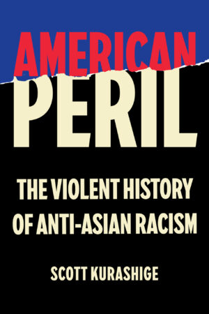
To convey both the timeline and the violence that this book covers without further perpetrating that violence was my main goal with this cover. The tear is a violent effect, and it is also a visual tool that both reveals and obscures. The color scheme is a reference to the broad time period covered: vibratingly bright, nearly neon red and cerulean signify the contemporary, while the off-white (it was exceedingly important to me that it did not read yellow) and charcoal are a reference to the past, or rather to how we think about the past—through a distorted and distanced sepia filter. The typeface is VTC Tatsuro (designed by Tré Seals), drawn based on the sign that Tatsuro Matsuda posted on his Oakland storefront in December 1941 that read “I AM AN AMERICAN.”
Image: Swiftynomics by Misty Heggeness
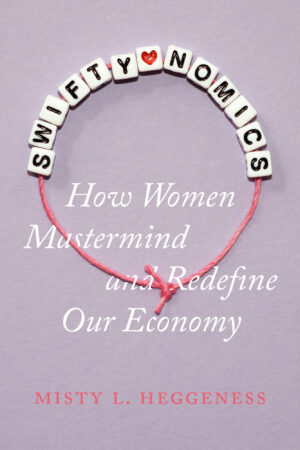
There were a couple of very strong visual concepts to play with for this cover. I considered glitter and fringe as possible ways to evoke the image of Taylor Swift without using her photograph. Ultimately, I selected the image of the friendship bracelet because this book is not about Taylor; it’s about her fans and how they choose to spend their money. The bracelets are often made at her concerts and traded between fans—an alternative economic exchange. The design also references beads as historical currency. I beaded this friendship bracelet and photographed it for the front cover; I also made an in-line version for the spine. During printing, the beads were spot-glossed to add sheen and dimensionality.
KBK:
Type-Only: Predicted by Mona Sloane

This one took a long time to get right. I knew a conceptual cover would be good for this book (and ultimately for this whole series about AI), and it took a lot of brainstorming to get my head around visualizing predictive AI technologies. As usual, the right solution was the simplest one.
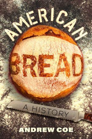
Image:
American Bread by Andrew Co
Sugar Coated by Marion Nestle and Lisa Sutherland
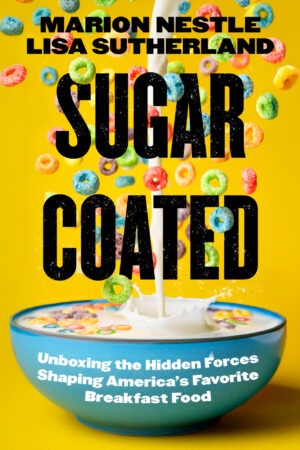
These two yet-to-be published titles about food (both forthcoming in 2026) feature illustrious spreads on the cover. American Bread features sourdough bread that I baked specifically for the cover, with “American” written in flour and “Bread” stenciled onto the loaf itself. Sugar Coated has an exploding bowl of breakfast cereal on the cover. Both were camera and Photoshop–intensive covers that were a blast to work on.
Are there any good resources for looking at other effective book covers?
KBK: I Need A Book Cover is a great place to start. It is a repository of book cover designs that is regularly updated and curated by founder and fellow book designer Zoe Norvell. Pinterest and other creative social media platforms like Dribble are other places to find ideas. Then there’s the king of all book cover inspiration mood boards: the library. When students come to me asking where they should seek inspiration, I, in turn, ask them: “Have you looked at any books lately, or are you stuck looking at screens again?” Books are meant to be held and looked at in person! Find a bookshelf somewhere and start browsing.